


We spoke to MIT’s antidisciplinarian César A. Hidalgo about big data and information. Famous for his views on why some economies flourish while others falter, César is an advocate on information and data as a powerful tool to drive decisions and economies.
Explain big data in 10 words!
Big data are digital traces produced in large scale operations.
Cesar, tell us a bit about you, and your history
I am a professor at MIT, where I run the Macro Connections group at the Media Lab. My group focuses on the development of tools that help people transform data into stories. My original training, however, is in Physics.

I hold a PhD in physics from the University of Notre Dame, where I did my PhD on the study of networks in the lab of Laszlo Barabasi. After completing my PhD, I spent a couple of years in Harvard, and in 2010, I started my group at The MIT Media Lab, where we have been developing data visualization engines from the moment I arrived.
What inspired you to creating the Observatory of Economic Complexity?
When my work on economic complexity became popular many people started asking me to make charts for them. These were complex charts, like the product space, which is a network that connects products that are likely to be co-exported and can be used to predict the mix of products that a country will export next. Since I did not want to spend my time creating these charts for particular cases, I decided to start creating tools that could automate the generation of charts. But when I began making these tools, I realized that there was a general shortage of technologies that people could use to quickly transform data into stories. This is when I realized that the creation of data visualization engines, like the OEC, or en.Dataviva.info, was something that was worth developing.
The Observatory of Economic Complexity makes international trade data and economic complexity indicators available through millions of interactive visualizations.
Can you show as an example of your work – tell us what it shows?
Examples of my work (which I execute together with my team) include the Observatory of Economic Complexity (OEC), which is the number one resource to visualize international trade data, dataviva.info, which makes available data for the entire formal sector economy of Brazil, and immersion.media.mit.edu, which allows people to visualize the networks they weave through email interactions. Other examples include pantheon.media.mit.edu, which visualizes memorable historical characters, and streetscore, which visualizes the parts of a city that look safe or unsafe.
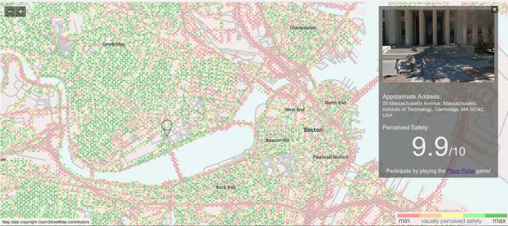
What makes a neighborhood look safe, lively, or depressing? And how does a city’s appearance affect the health and behavior of its residents? We can’t answer these questions with census data alone; we need quantitative tools that can measure the visual appearance of a city. StreetScore, a project by the Camera Culture and Macro Connections groups at the Media Lab, is a tool that measures how safe a street view looks to a human — but using a computer.
The OEC and Dataviva help us understand how the industrial structure of countries and cities change over time. Immersion helps you see the professional network you weave implicitly using email, and helps you become more strategic about your interactions. Pantheon is helping us understand how languages and technology shape human collective memory. Streetscore is helping explore the connection between urban perception, urban change, and crime.
What is your favourite data visualisation that you’ve created – tell us about how you went about creating it?
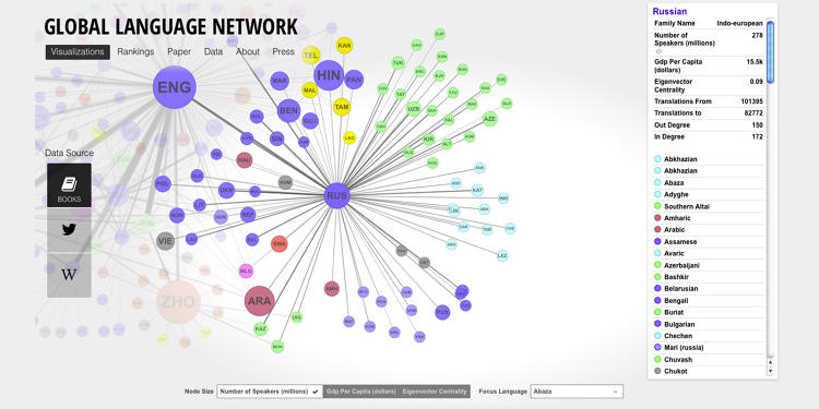
There are many that I like. I like the product space, which helps you predict the mix of products that a country will make next. I also like the Global Language Network, which shows you which languages are likely to be co-spoken (language.media.mit.edu). What I like most about these sites, however, is not any individual visualization, but the ability they give you to compose narratives by combining them. That for me is what is different from our approach.
Why is data visualisation so important and what do you see as your main focus in the short to medium term future?
Data visualization is an essential tool for anyone wanting to transform data into stories. And transforming data into stories is how humans generate understanding. So I believe data visualization is a field that is poised to grow, and here to stay.